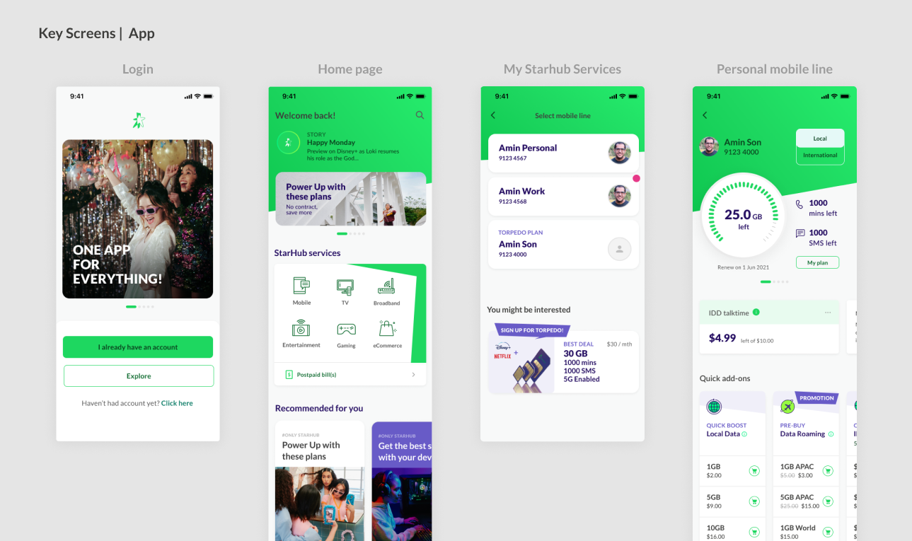
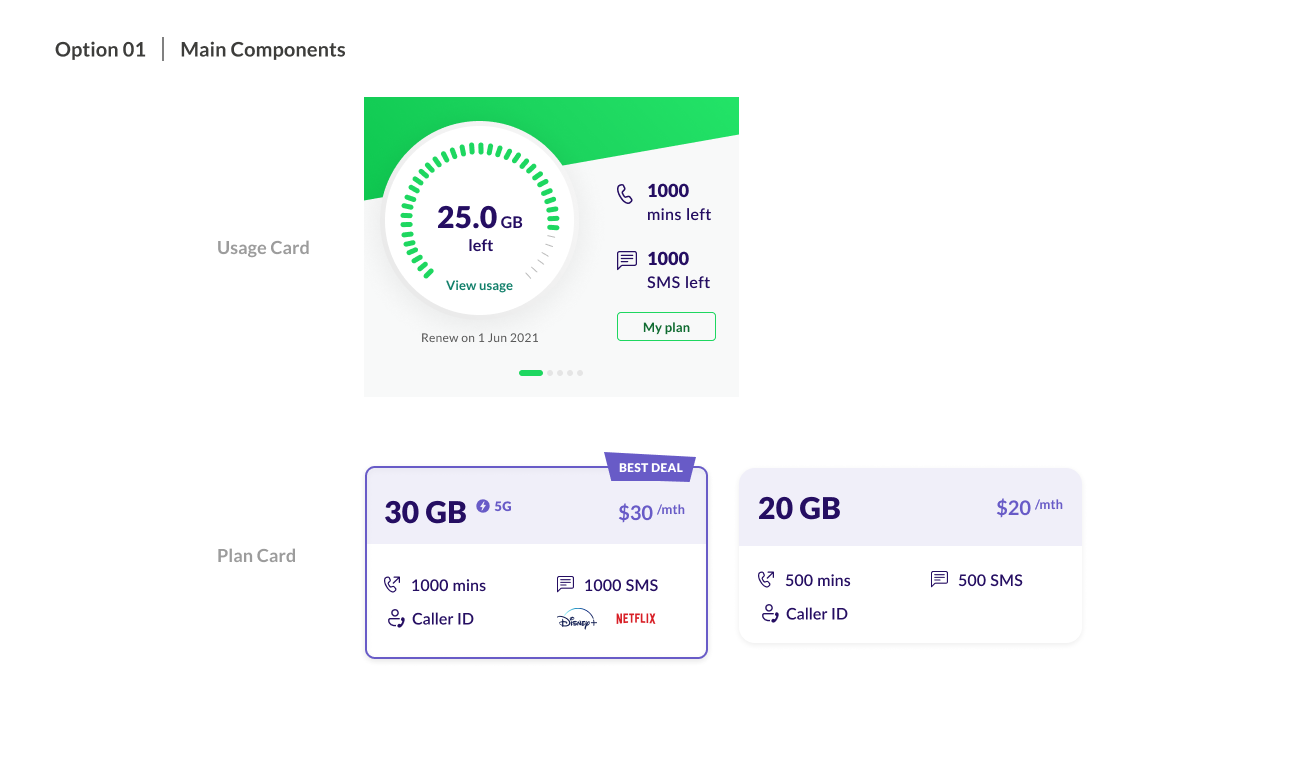
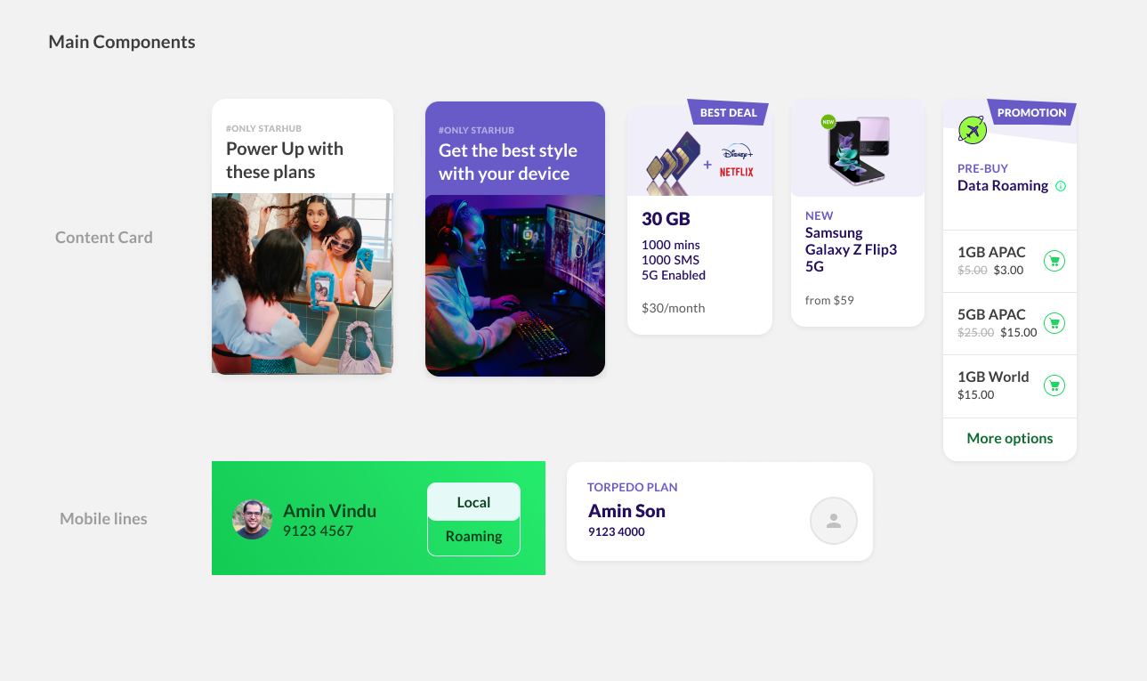
Over a two-year transformation programme, StarHub undertook a major revamp of its customer self-service mobile app to reposition it from a utility-driven experience into a commercial growth platform.
I joined the initiative as a Lead Project Designer, owning the MVP design phase, where foundational UX decisions were made before the product went into full-scale development and launch.
Working within project team, I partnered closely with the Product Owner, Digital Lead, Tech teams, and vendors to shape the MVP experience that would set the long-term direction of the app.
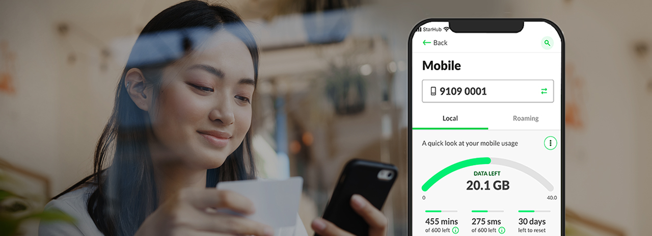
Previous StarHub customer app
Historically, the app served existing customers who relied on it for fast, habitual tasks such as checking data usage, managing bills, and account servicing. The new business direction required the homepage to actively promote products, rewards engagement and drive monetisation. This was not a visual redesign problem, it was a behavioural and trust problem.
From a user perspective:
From a business perspective:
If unresolved, this would lead to:
As Lead Product Designer for the MVP, I was accountable for:
Defining the homepage UX strategy during the transition from utility-first to commerce-enable.
Translating business intent into user-safe experiences
Facilitating alignment between Business, Product, Digital stakeholders and Tech teams
Although I exited the company prior to public launch, the MVP design established the structural used in development phase.

During the MVP phase, several homepage decisions were initially driven by technical convenience, particularly around navigation hierarchy which would reduced access points to utility functions
Rather than relying on subjective debate, I introduced A/B testing as a decision tool to align stakeholders around real user behaviour.
While feasible, this approach carried high UX risk for existing users with strong task-based habits.

At the project’s outset, solution engineers proposed a dual-system approach, allowing users to select the appropriate system for their journey within the apps.
User data guides the design, ensuring essential features remain visible and accessible. Due to tech limitations, two design approaches were tested using unbiased A/B testing to optimize the user experience.


The research shows that the SUSS score, 51 (2 doors) vs 61 (1 entry), shows that both approaches weren’t ideal. However, 1 door has a better response than another.
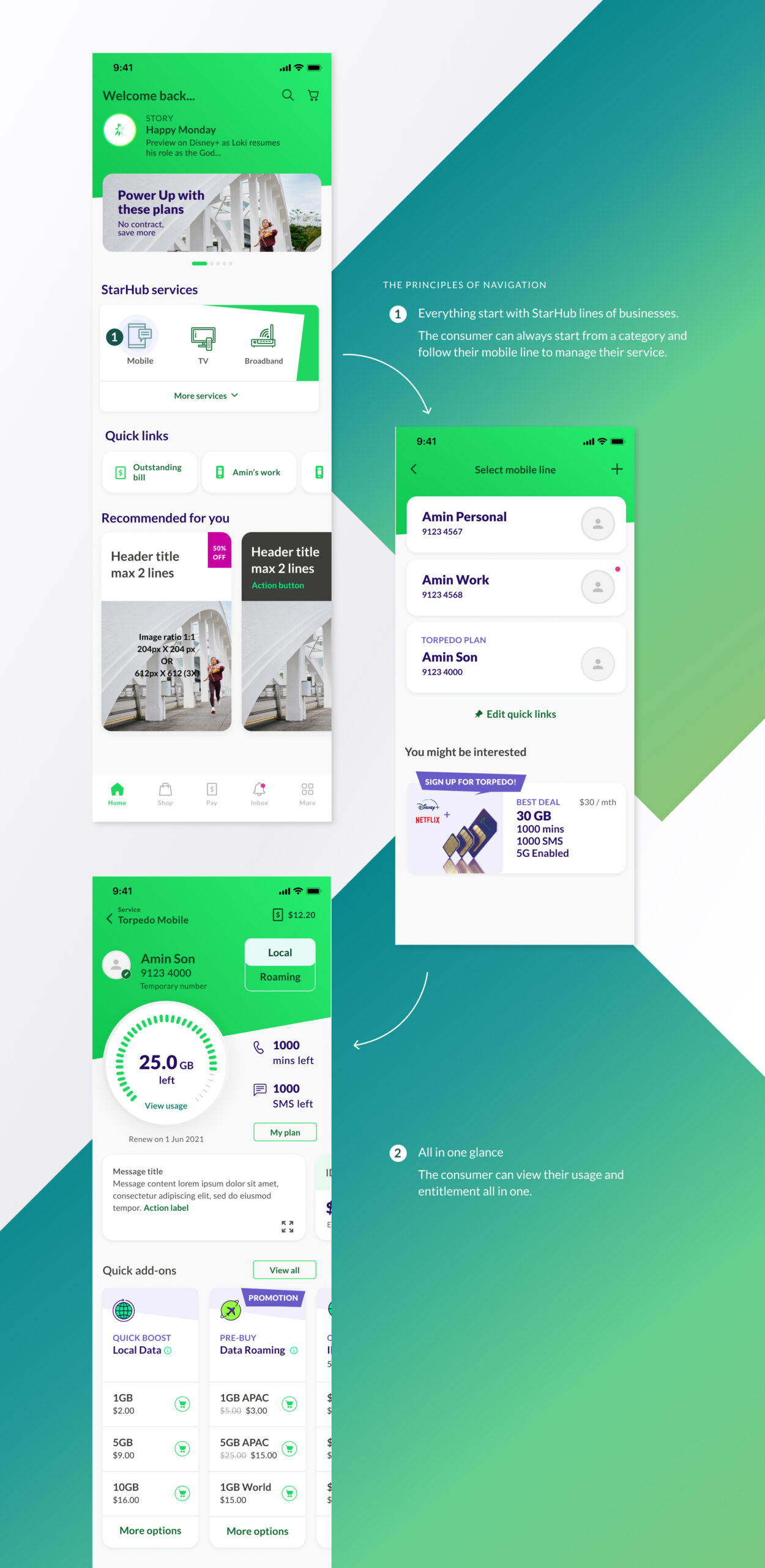
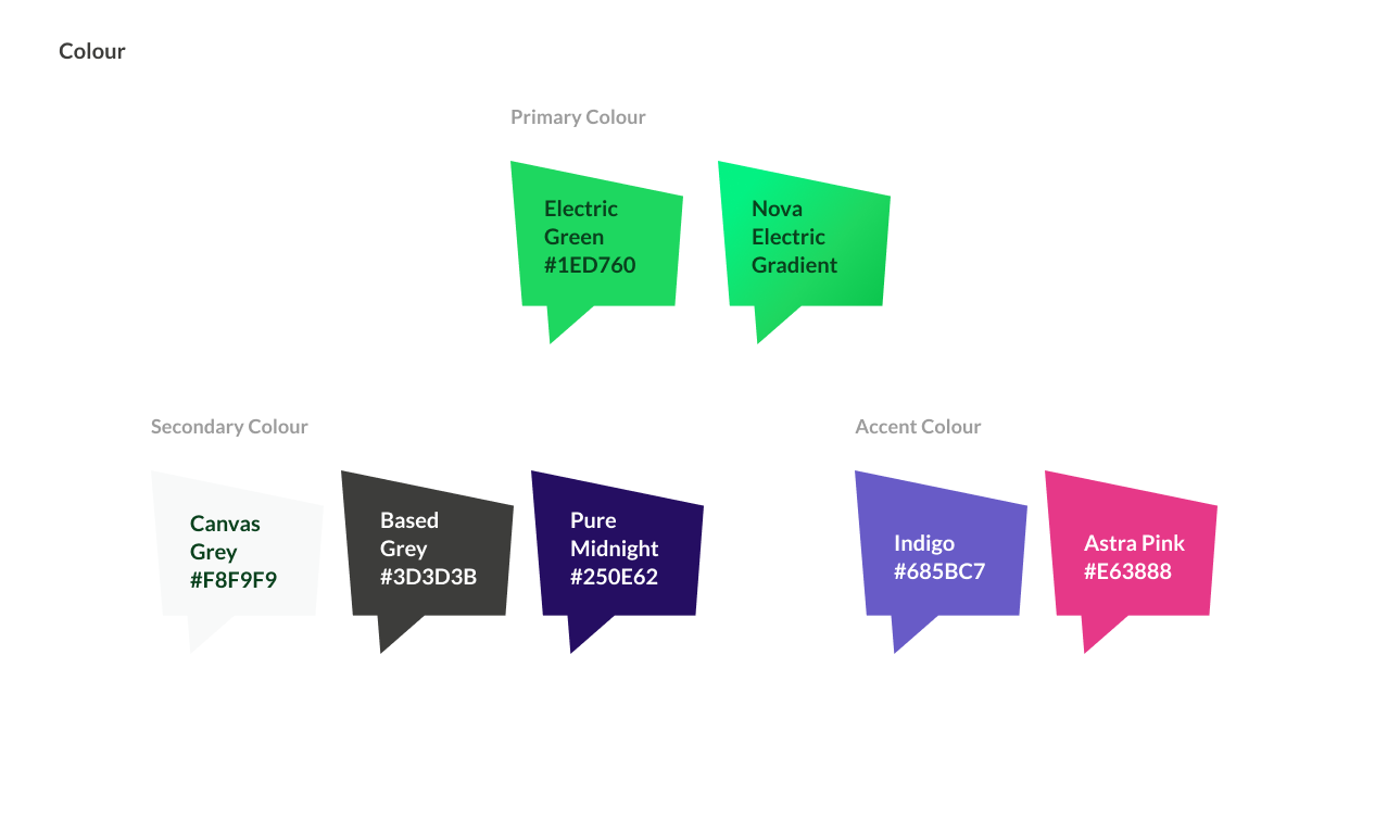
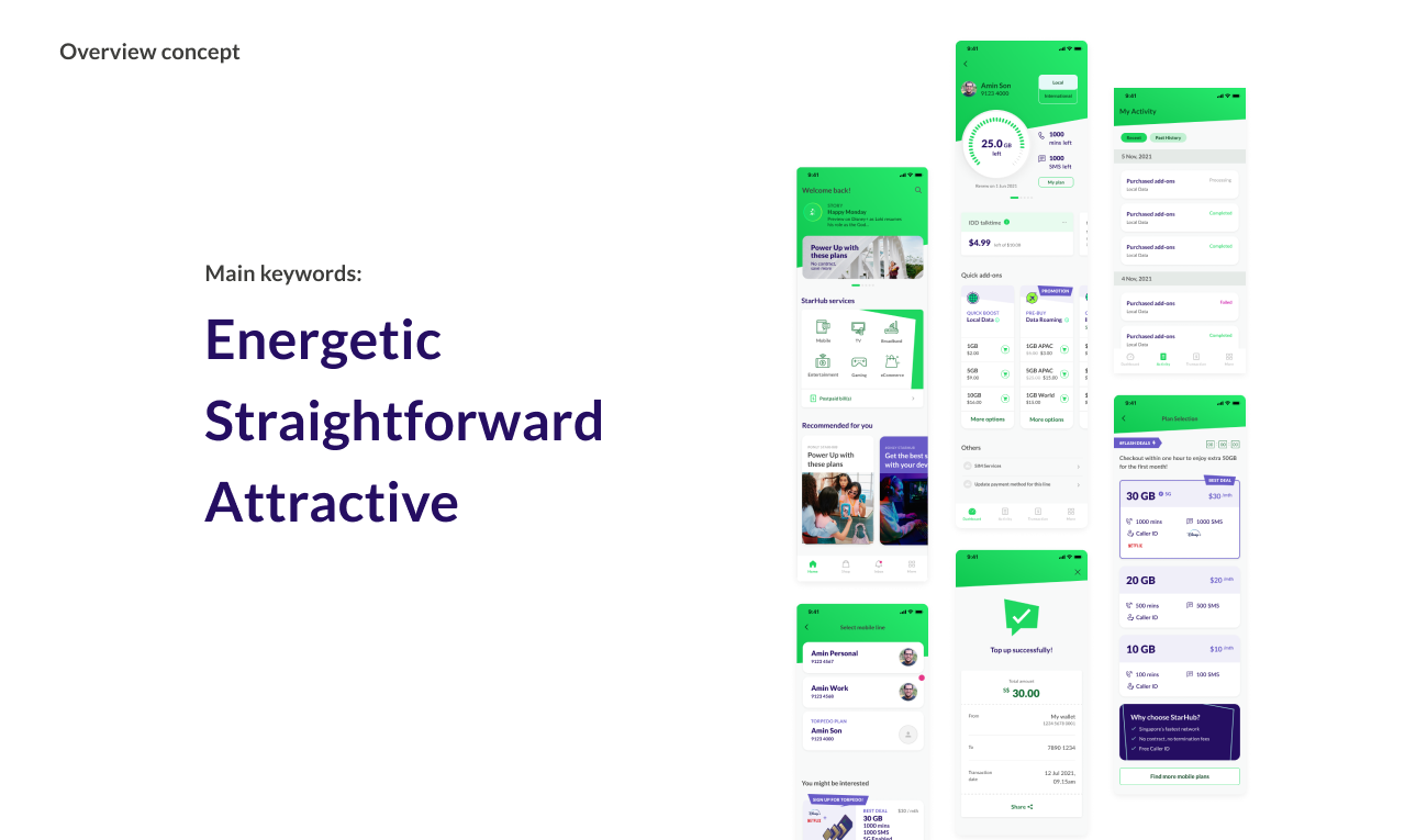
The project also included a design system overhaul to give the apps a new look and feel. This helped to improve consistency, usability, and maintainability.
